
Effective Datadog Dashboards

Woah now, hold on a second - get your mouse away from that “New Dashboard” button, we’ve got a few things to talk about first. Clearly you’re well on your way to using Datadog. If you’re about to create a new dashboard, it’s probably safe to assume that you have some sort of data flowing into your account, and now it’s time to take a look at it. The good news is that it’s super easy to get started with creating a dashboard, but it’s more difficult to make it an effective dashboard. Let’s make that last part easier for you.
Before we even click that button there’s a point to discuss that’s a really important principle with Datadog - reusability. Pretty much everything within the platform is based on tags, allowing you to filter and split your data by integration, agent, and user defined tags. Tagging also allows for adding template variables to dashboards, allowing you to reuse the same dashboard for many different views. Back in the old days you might have 3 dashboards showing the same data, but there was one for each region/data center/application/etc (or, one dashboard that showed all of it with repeated panels) because metrics were a single series that categorized the data within the metric name. For example, you may have had metrics named something like “nginx.net.writing.datacenter.environment.host”. Now, we’d have “nginx.net.writing” with tags for datacenter, environment, and host. This allows for significant flexibility when it comes to dashboarding, because now your visualizations can be more dynamic through the use of tags. In any case, this is a long way to say “give your dashboard a good name that tells someone what it is but isn’t overly descriptive because that’s not necessary because it’s dynamic” (which is also a long way of saying “keep it simple”). So, don’t name your dashboard (for example) “NGINX performance - production - east coast datacenter”. Just name it “NGINX performance”.
That whole blurb about making dashboards dynamic is a perfect segue into this next point - utilize template variables. Now, these aren’t always necessary depending on what you want to look at, but if you know you’ll want to look at the same data for different environments/applications/endpoints/etc, you’ll want to start your dashboard with template variables. You can add these later of course, however we find it easier to start with them, since they pop up in the filter/split portions of the query widgets right away and make it easy to build these in from the start. If you don’t know what tags you want to use as variables, that’s okay! Firstly, starting with “env” is never a bad idea. Secondly, let’s figure out what else we want to use by thinking about the data we’re trying to display on our dashboard. For the sake of example, we’ll say that we’re building a custom dashboard for visualizing our Docker environment. Head over to the metric summary page, and type “docker” into the search bar.
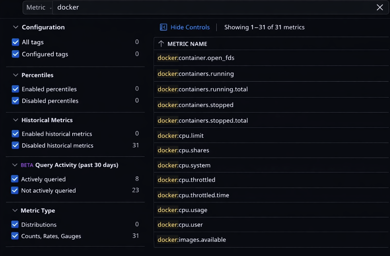
CPU usage seems like a good starting point, so we can see what tags are present for this metric by clicking on it.
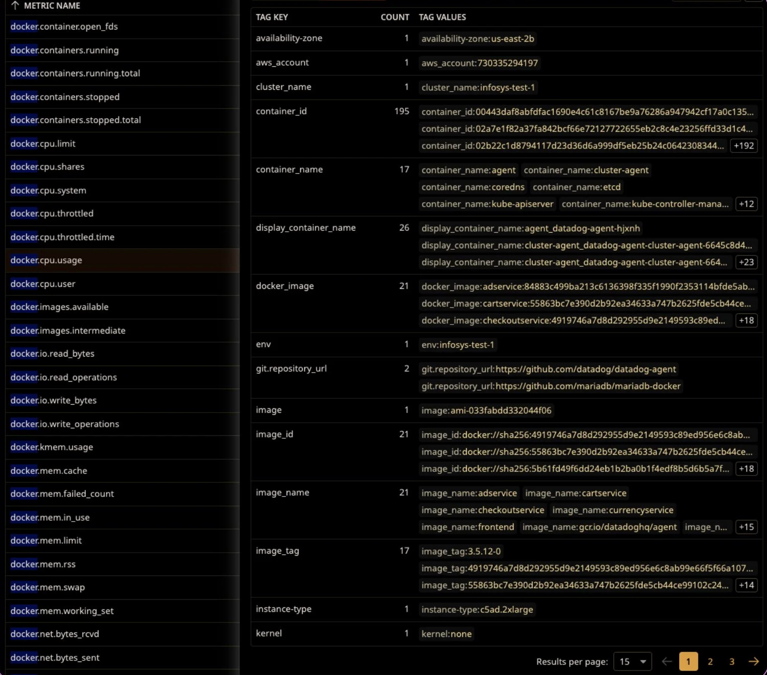
We’re starting to see some things that have a number of values that could be really important to us! There are some very high level tags like aws_account and availability-zone, middle level tags like image_name, and specific level tags like container_id. Let’s put a few of these to use.
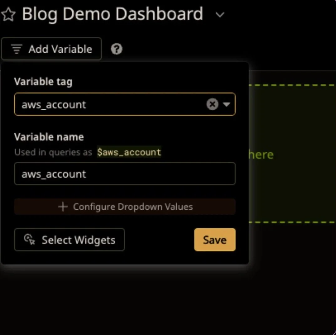
Clicking on “Add Variable” will give us a list of tags that we can use. We’ll start with the high level tags, like “env” and “aws_account”.
Carry along adding some more, and your dashboard will start to look like this
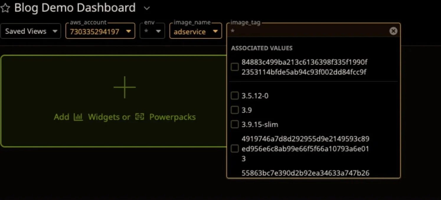
We can already start to see the benefits - by selecting some tag values, we can automatically find related values as we go down the line. We don’t need to know the exact value of image_tag to use this; we can narrow it down by selecting the image_name of the service we’re looking to inspect. Now when it comes to using your data, we can put this into place.
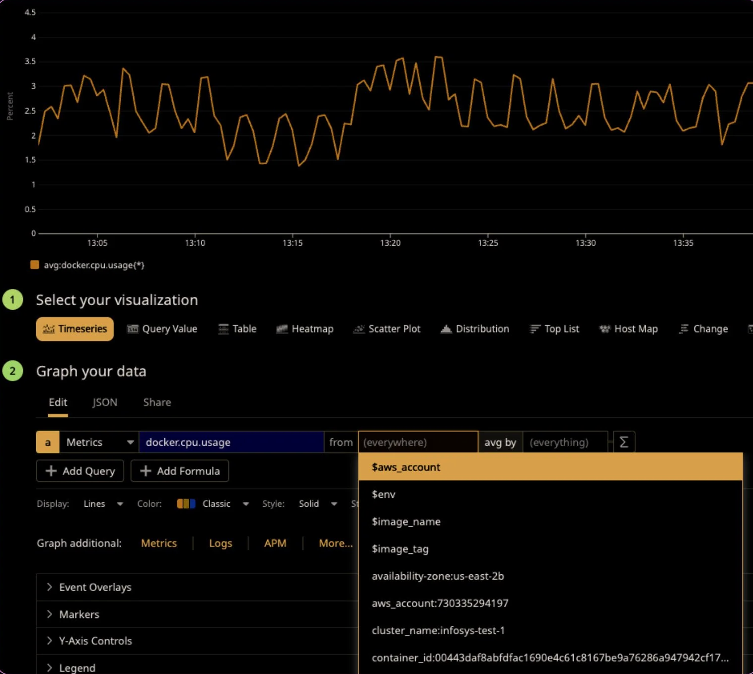
Like we mentioned earlier, template variables will always be at the top of your tag list, so we can easily put them in the widget. So, let’s try this out.
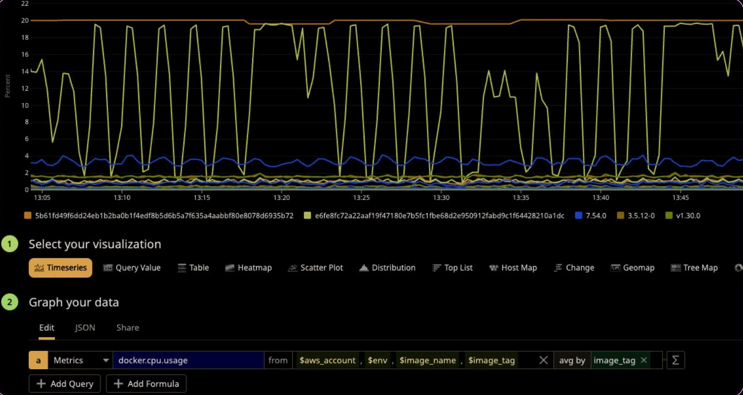
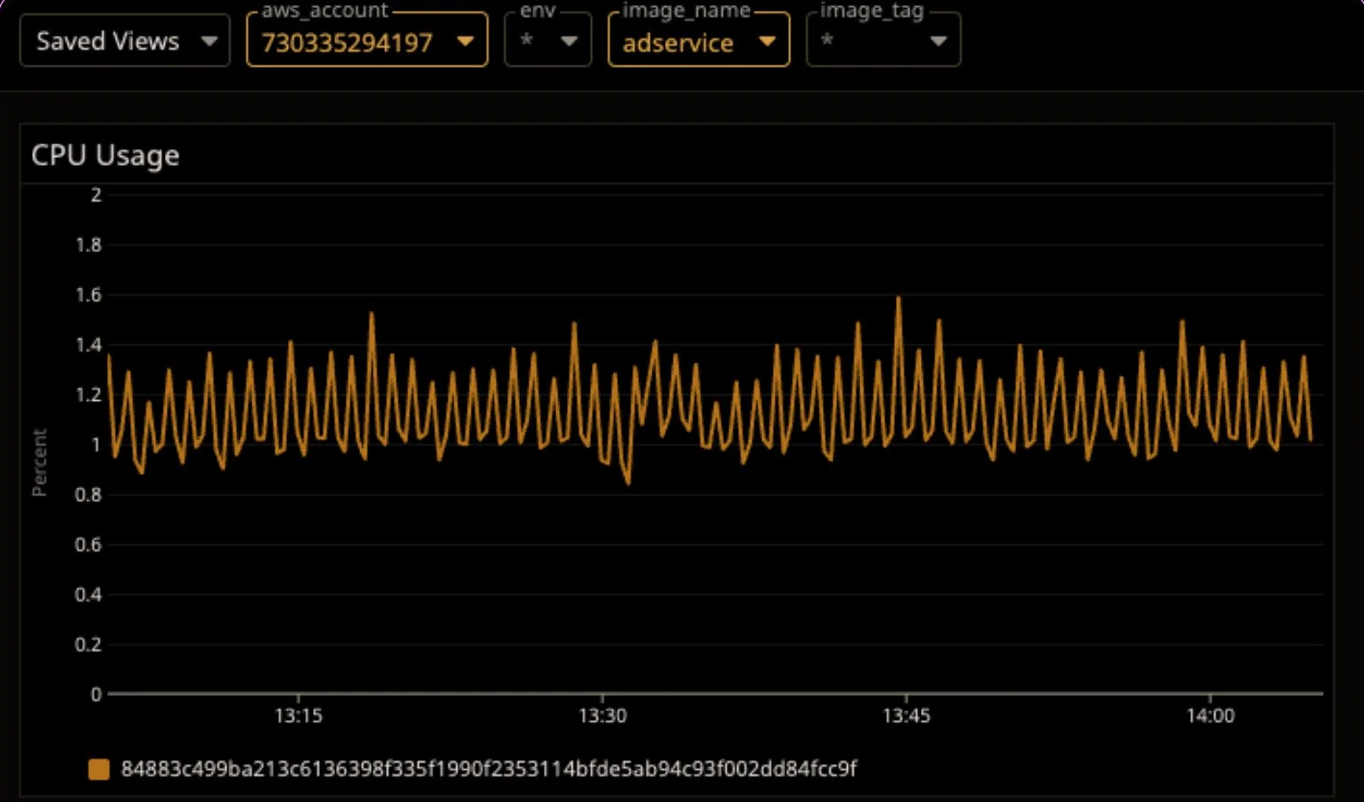
The template variables filter down what we’re looking for, and then the “avg by” tag is used to split data. We can see here that this makes a number of lines on the graph, and we can see different image tags in the legend. But if we then use our template variables…
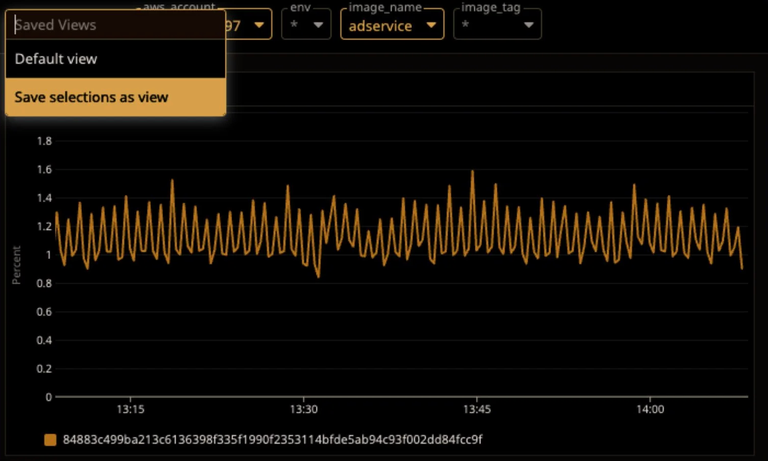
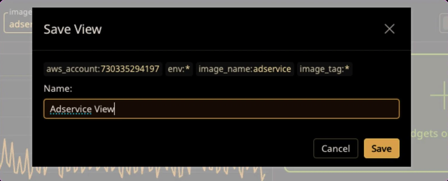
Take this principle and apply it to all of your panels, and now you have the power of one dashboard for many, many views. To that point, as a bonus - you can save a templated view for later, so you don’t have to remember which values to punch in for a view you want to keep defined. In the top left corner, click “Saved Views”, and
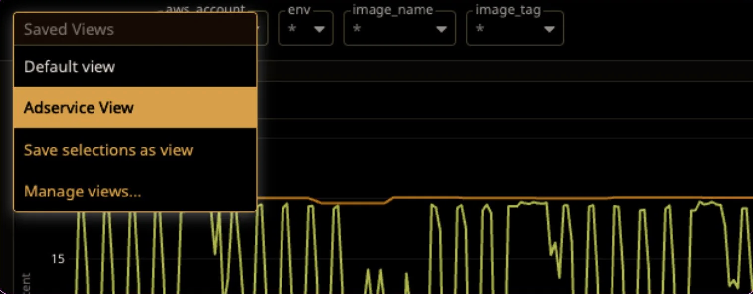
And now, we can load this dashboard and select this view and be back to exactly where we were. You can also just bookmark the dashboard with template variables selected, since they wind up in the URL, but that means it’s only bookmarked for you and your team can’t use it. Saved views persist across the account for everyone.
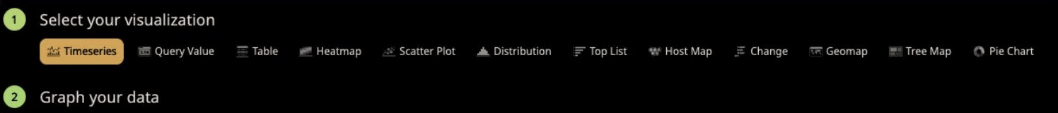
So what’s our next step? Let’s start finding the best way to visualize our data. It may be one way, but sometimes it’s multiple! Datadog has a number of ways to display your data and they all have their uses, but you will need to do a little bit of work to find out what works best for you. There’s absolutely nothing wrong with starting with a regular old time series chart. This will work with pretty much everything and show your data over the selected time frame. Hooray! It can also be extremely valuable to display the same data in a few different ways. Using a top list and a table next to your time series charts can provide valuable context that a time series alone doesn’t provide, or makes it hard to read.
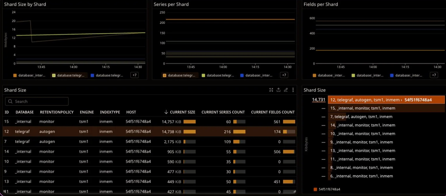
If you add a table and a top list, you can now mouse over a table row, and it will highlight the corresponding time series and toplist entries. In comparison, look at the legends of the time series charts. This example table clearly shows us the database, shard id, and some other info, whereas the time series chart shows us cutoff values. Figuring out what chart type works best can be pretty simple. What I like to do is create my initial time series widget, and then clone it (just so I can freely mess with it without ruining my other widget!) and start to change the visualization type right in the panel.
Some chart types require different ways of expressing the data, but this method makes it generally simple to experiment.
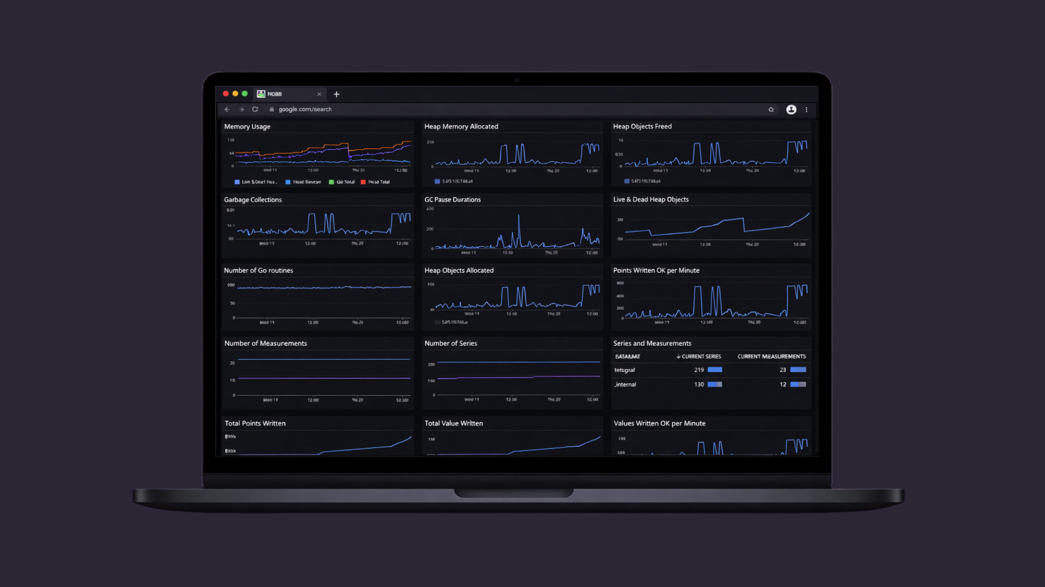
By this point you’re cruising and building an awesome dashboard - good work! But, does it look something like this?
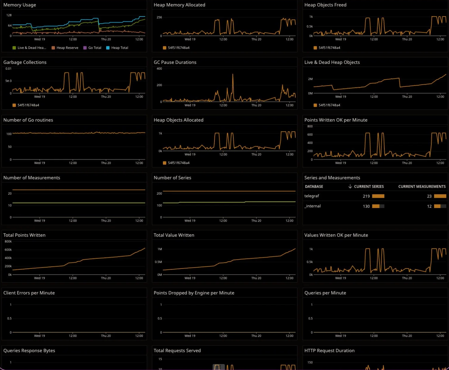
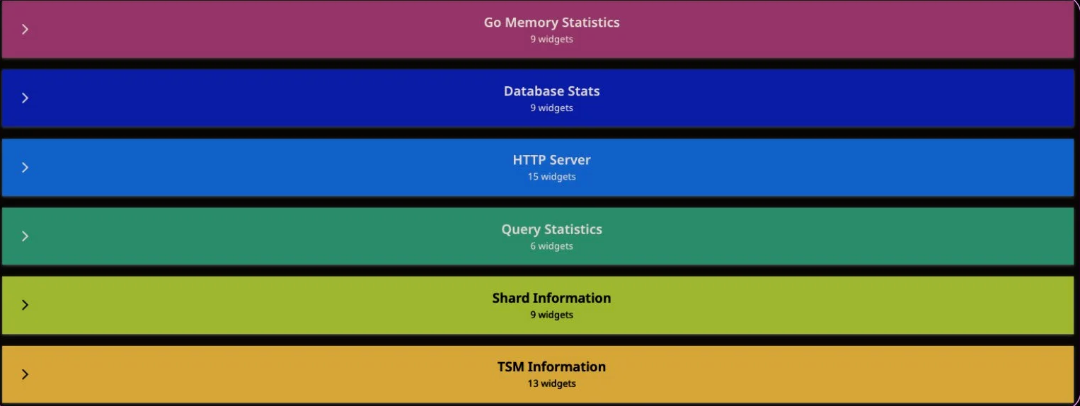
And does it go on and on past this? This can get really tough to read, and really tough to decipher or hand off to someone else to look at. One of the best things that you can do is to begin categorizing your panels by using group widgets. Create a group from the widget menu, give it a good name (and a color, if you feel fancy), and drag your related widgets into it. Now our dashboard looks more like this:
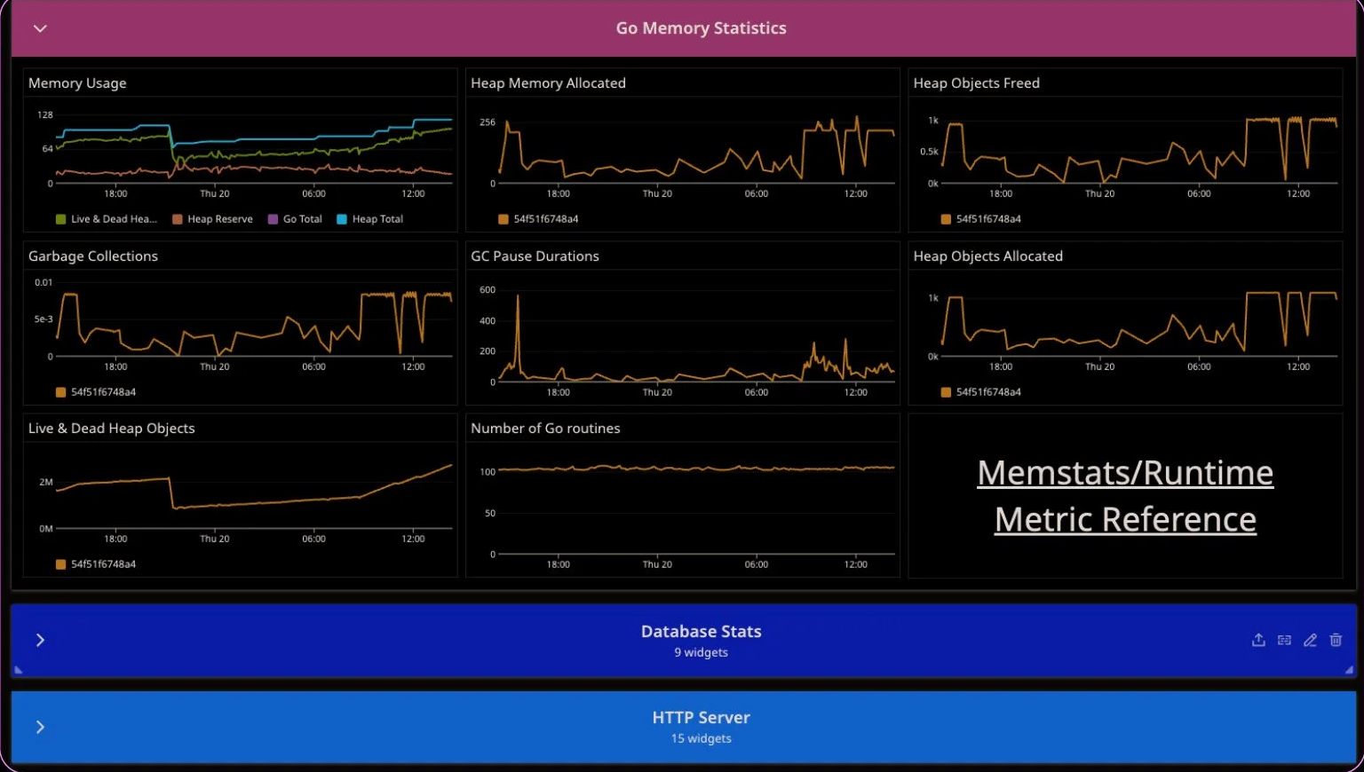
And we can open up an individual group to look at the information inside
The first grouped screenshot shows a total of 61 widgets. Can you imagine trying to look at and understand a dashboard that presents all of that information at the same time? I’ll tell you - it’s not fun or productive.
Congrats! You’ve now made a dynamic, organized, and informative dashboard in a way that can be shared across your organization. So what’s next? More dashboards! Or, implementation of other features like APM, or even the creation of monitors. We’ll have more posts coming about some of these topics soon, but if you need some help in the meantime, reach out to us at sales@nobs.tech.